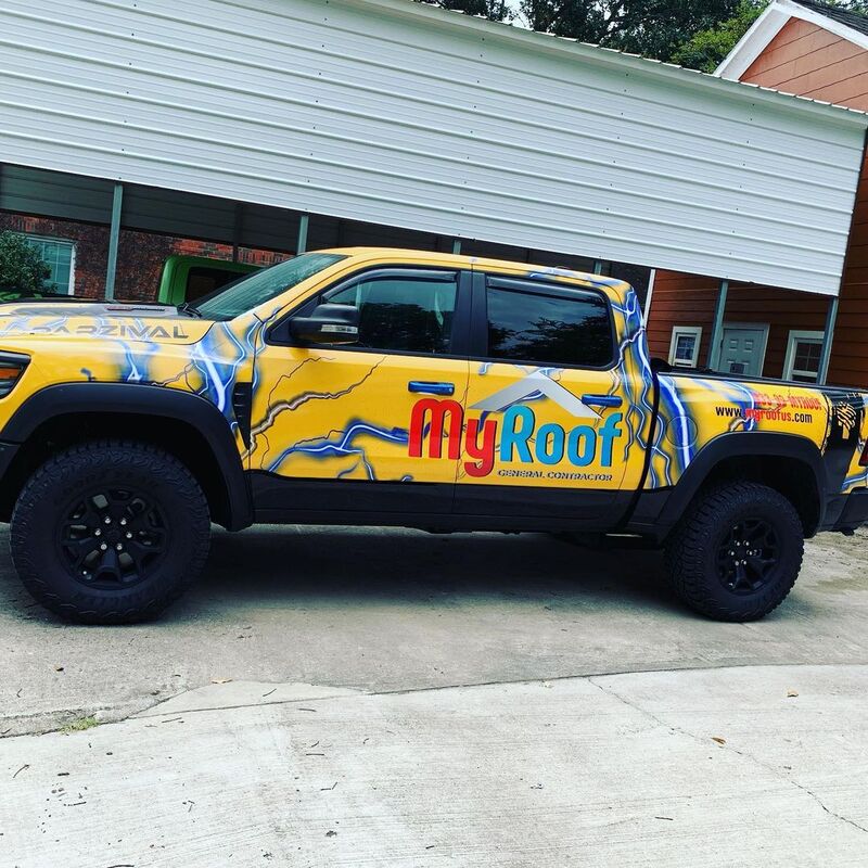
Avoid These 5 Common Mistakes in Vehicle Wrap Design
A vehicle wrap is a powerful tool, but a poor design can actually hurt your brand. Here's how to avoid the most common pitfalls and ensure your wrap is as effective as it is eye-catching.
A vehicle wrap is a powerful tool, but a poor design can actually hurt your brand. At SignCo, we've seen how easy it is to fall into the "clutter" trap. Here is how to ensure your wrap is as effective as it is beautiful.
1. Designing for a Flat Surface
The most frequent mistake is ignoring the vehicle's actual contours. A car is a 3D object with door handles, fuel caps, and deep body lines. If your designer doesn't account for these, your phone number might end up sliced in half by a door seam or your logo could be distorted over a wheel well.
Always use precise vehicle templates for the specific make, model, and year of your vehicle. At Signco, every design is built around the exact dimensions of your car or truck — never a generic template.
2. Overcrowding with Information
Your vehicle is not a flyer. People often have less than three seconds to read your message as you drive by. If you try to list every service, social media handle, and physical address, the viewer will walk away with zero information.
Stick to the essentials:
- Company Logo / Name
- Primary Service (e.g., "Emergency Plumbing")
- One Clear Call-to-Action (Website or Phone Number)
3. Using Hard-to-Read Fonts
While a stylized script might look "cool" on a monitor, it's often illegible at 50 mph. Use bold, sans-serif fonts for maximum readability. A good rule of thumb is the 10-by-1 rule: letters should be at least one inch tall for every 10 feet of viewing distance.
4. Poor Color Contrast
High contrast is the secret to visibility. A dark blue logo on a black van will disappear. For the best results, use light text on dark backgrounds or vice-versa. If you aren't sure if your colors pop, try viewing your design in grayscale — if you can still read it easily, the contrast is strong enough.
5. Using Low-Resolution Graphics
Nothing looks more unprofessional than a pixelated logo stretched across a van. Always provide vector graphics (.svg, .ai, or .eps files). Blurry images signal low quality and can make potential customers doubt the quality of your actual work.
Pro tip from Signco: Not sure if your files are print-ready? Send them over and we'll let you know. We also offer in-house vector conversion through our Vector Lab service.
Have a design in mind but not sure where to start? Contact us for a free consultation — our in-house design team will make sure your wrap is built to impress.
You Might Also Like
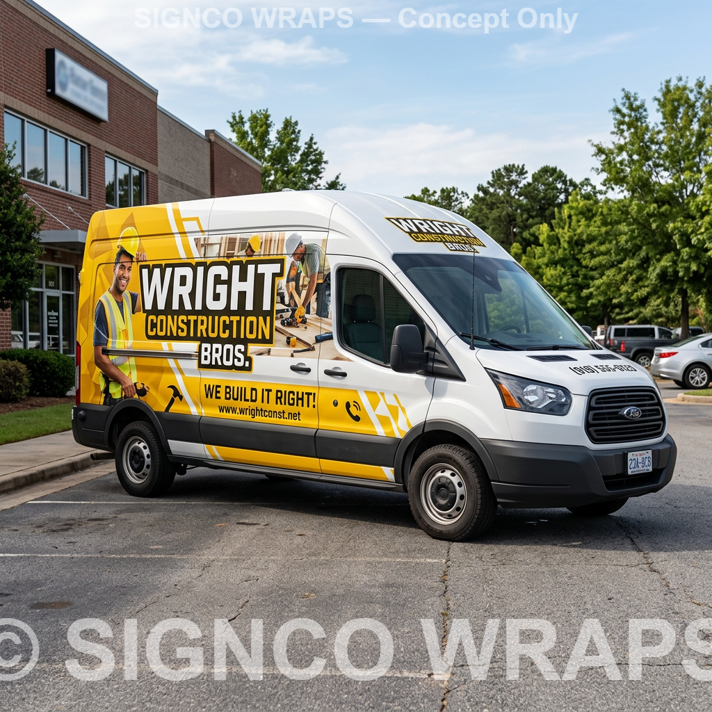
How to Roll Out a Fleet Wrap Across Multiple Vehicles Without Slowing Down Your Business
Wrapping one company vehicle helps. Building a consistent fleet image helps even more. Here is how to roll out multiple branded vehicles without slowing down your business.
Read More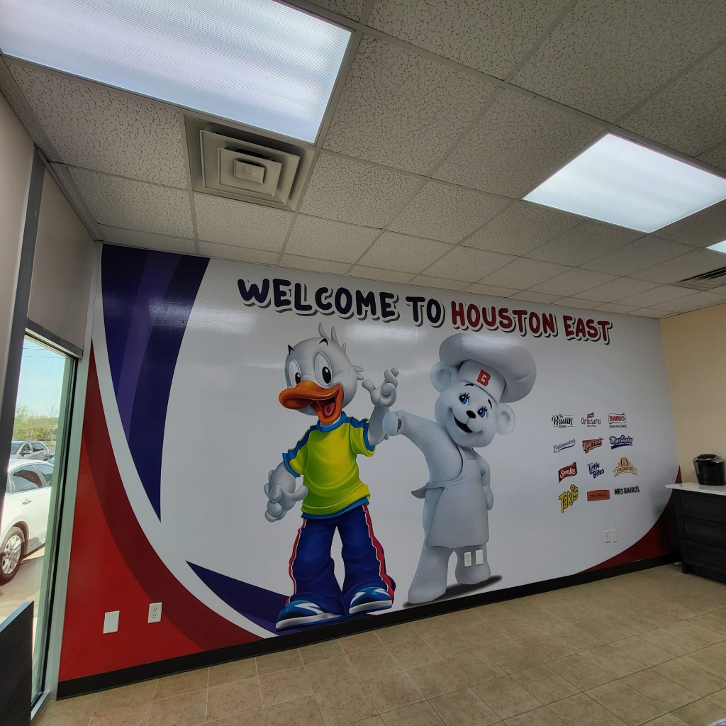
Beyond the Bumper: Why Wall Wraps are the Ultimate Marketing Machine for Your Business
Transform your business space with custom vinyl wall wraps. Signco Vehicle Wraps in Baytown, TX installs high-impact wall murals, motivational graphics, service area maps, and award displays for gyms, offices, schools, and more. See real projects from MD Anderson, Baytown Athletics, and local Houston businesses.
Read More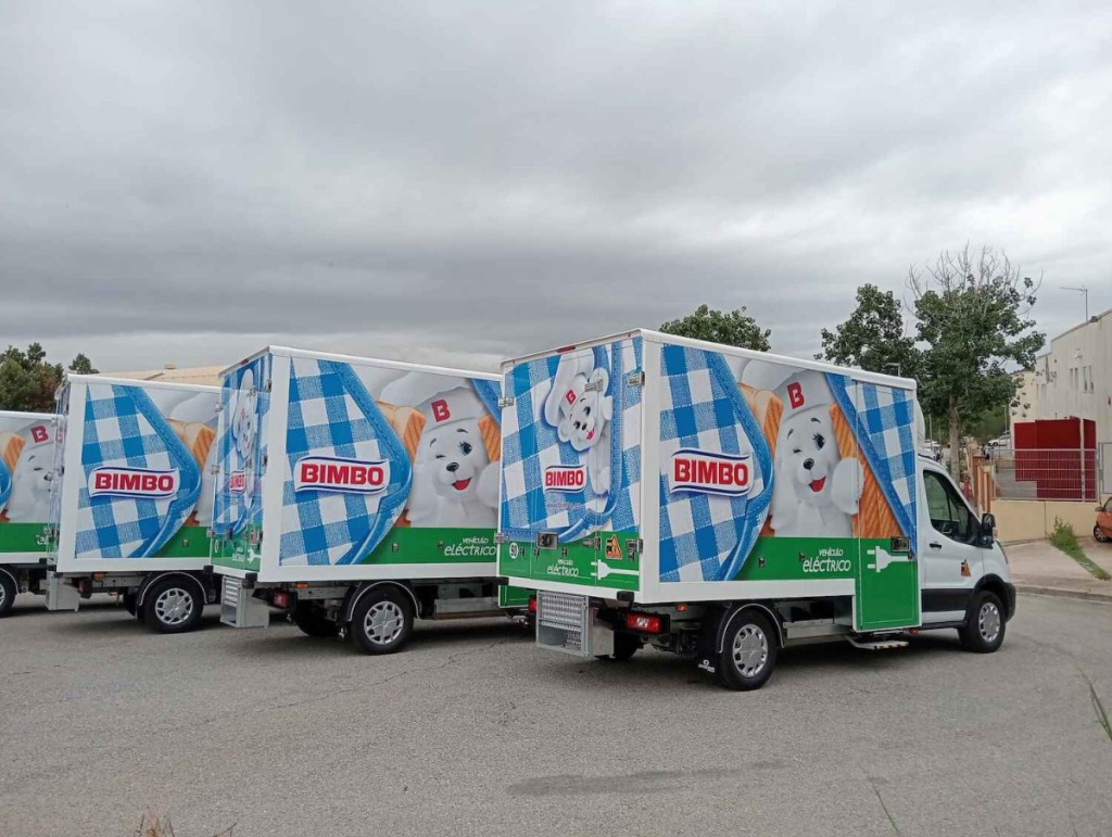
5 Reasons Your Business is Invisible Without a Vehicle Wrap
In today's oversaturated digital world, your company vehicle may be your most underutilized marketing asset. Here's why a professional wrap could be the highest-ROI investment you make this year.
Read More